scRNA-seq_数据复现

单细胞转录组数据降维聚类分群图表复现初尝试

1. 这次我们要复现的单细胞数据来自International Journal of Cancer 2020年发表的一篇单细胞相关的纯生信文章。该文章数据链接:GSE150321

2. 简单浏览文章,抓取作者针对单细胞数据分析给出的一些参数信息,如下

Step 0、加载需要的R包

1
2
3
4
5
library(Seurat)
library(dplyr)
library(patchwork)
library(mindr)
library(Matrix)

Step 1、数据准备

1
2
3
4
5
6
7
8
9
10
11
12
13
14
15
setwd("//home//data//gongyuqi//R")
#文章测序了两个病人的样本,正文figure展示的是其中一个病人的单细胞测序结果。我们下面的分析使用正文中展示的样本
#读入数据并将表达矩阵转成稀疏矩阵,减少数据对空间资源的消耗以及运算资源的消耗
GSM4546857<-read.csv("GSM4546857_LSCC01_DBEC_UMI.csv",comment.char = "#")
dim(GSM4546857)
GSM4546857[1:4,1:4]
rownames(GSM4546857)<-GSM4546857$Cell_Index
GSM4546857<-GSM4546857[,-1]
GSM4546857<-t(GSM4546857)
object.size(GSM4546857)#2331231144 bytes
GSM4546857_sparse<-as(as.matrix(GSM4546857),"dgCMatrix")
GSM4546857_sparse[1:4,1:4]
object.size(GSM4546857_sparse)#166367952 bytes
save(GSM4546857_sparse,file = "GSM4546857_sparse.Rdata")
dim(GSM4546857_sparse)

在此,可以直观的感受一下两种矩阵的大小

Step 2、创建Seurat对象

1
2
3
4
5
6
7
8
9
10
11
12
#下面这段代码中,最重要的就是创建Seurat对象以及去除线粒体基因,其他都是对Seurat对象的可视化,其目的在于提高初学者对该对象的了解
## =============== 创建Seurat对象
tissu1 <- CreateSeuratObject(counts = GSM4546857_sparse, project = "LSCC", min.cells = 3, min.features = 200)
tissu1

## =============== 去除线粒体基因
# The [[ operator can add columns to object metadata. This is a great place to stash QC stats
#此次数据检测到大量线粒体基因
grep(pattern = "^MT\\.",rownames(tissu1),value = T)
tissu1[["percent.mt"]] <- PercentageFeatureSet(tissu1, pattern = "^MT\\.")
head(tissu1@meta.data,5)
summary(tissu1@meta.data$nCount_RNA)

看一看过滤前数据情况

1
2
3
4
5
6
7
8
9
10
11
12
13
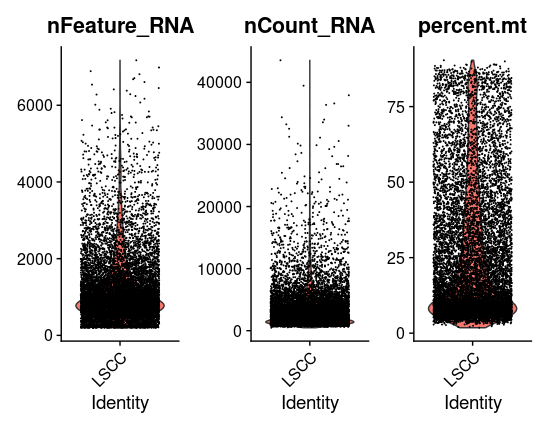
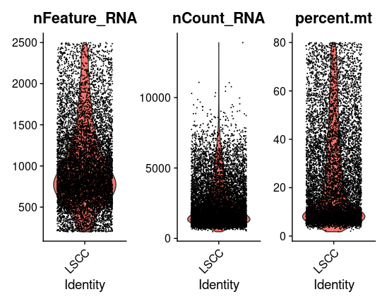
# Visualize QC metrics as a violin plot
VlnPlot(tissu1, features = c("nFeature_RNA", "nCount_RNA", "percent.mt"), ncol = 3)
# density
data<-tissu1@meta.data
library(ggplot2)
p<-ggplot(data = data,aes(x=nFeature_RNA))+geom_density()
p

# FeatureScatter is typically used to visualize feature-feature relationships, but can be used
# for anything calculated by the object, i.e. columns in object metadata, PC scores etc.
plot1 <- FeatureScatter(tissu1, feature1 = "nCount_RNA", feature2 = "percent.mt")
plot2 <- FeatureScatter(tissu1, feature1 = "nCount_RNA", feature2 = "nFeature_RNA")
plot1 + plot2

这里我们主要展示数据过滤前nFeature_RNA, nCount_RNA, percent.mt的情况

1
2
3
4
5
#Seurat官网给出的质控标准中,percent.mt < 5,但不同组织不同细胞中线粒体含量存在差异,要根据自己的具体情况进行调整,
#但是!!!太夸张啦!太夸张啦!我们这里线粒体基因阈值设置在80%,最终得到的细胞数为9796个,如果设置成95%,得到的细胞数也小于原文中的10699。太夸张啦!为了复现文章,我们先定成80。
tissu1 <- subset(tissu1, subset = nFeature_RNA > 200 & nFeature_RNA < 2500 & percent.mt < 80)
tissu1
VlnPlot(tissu1, features = c("nFeature_RNA", "nCount_RNA", "percent.mt"), ncol = 3)

这里我们主要展示数据过滤后nFeature_RNA, nCount_RNA, percent.mt的情况

Step 3、标准化

1
2
3
4
5
## =============== Normalization
tissu1 <- NormalizeData(tissu1, normalization.method = "LogNormalize", scale.factor = 10000)
#标准化后的值保存在tissu1[["RNA"]]@data
normalized.data<-tissu1[["RNA"]]@data
normalized.data[1:10,1:4]

Step 4、鉴定高变基因

1
2
3
4
5
6
7
8
9
10
11
12
13
14
15
## =============== Identification of highly variable features
#Seurat官方默认找前2000高变基因,用于下游的PCA降维分析
#文章中作者是找的前2500,我们这里也就找前2500个高变基因
#高变基因:在一些细胞中高表达,在另一些细胞中低表达
#变异指标:mean-variance relationship
tissu1 <- FindVariableFeatures(tissu1, selection.method = "vst", nfeatures = 2500)

# Identify the 10 most highly variable genes
top10 <- head(VariableFeatures(tissu1), 10)
top10

# plot variable features with and without labels
plot1 <- VariableFeaturePlot(tissu1)
plot2 <- LabelPoints(plot = plot1, points = top10, repel = TRUE)
plot1 + plot2

Step 5、降维

1
2
3
4
5
6
7
8
9
10
11
12
13
14
15
16
17
18
19
20
21
22
23
24
25
## =============== 1. Scaling the data
#Seurat默认是做前2000个基因的归一化
#如何有热图展示需求的小伙伴,可以做全部基因的归一化,方便后续分析,我们这里就全部基因进行归一化
all.genes <- rownames(tissu1)
tissu1 <- ScaleData(tissu1, features = all.genes)

## =============== 2. PCA降维
tissu1 <- RunPCA(tissu1, features = VariableFeatures(object = tissu1))
# Examine and visualize PCA results a few different ways
print(tissu1[["pca"]], dims = 1:5, nfeatures = 5)
#visualization
VizDimLoadings(tissu1, dims = 1:2, reduction = "pca")
DimPlot(tissu1, reduction = "pca")
DimHeatmap(tissu1, dims = 1, cells = 500, balanced = TRUE)
DimHeatmap(tissu1, dims = 1:20, cells = 500, balanced = TRUE)

## =============== 3. PC个数的确定
#这个非常非常具有挑战性,针对这个问题有很多教程,我们这里不着重讨论,因为我们主要是图表复现
# NOTE: This process can take a long time for big datasets, comment out for expediency. More
# approximate techniques such as those implemented in ElbowPlot() can be used to reduce
# computation time
tissu1 <- JackStraw(tissu1, num.replicate = 100)
tissu1 <- ScoreJackStraw(tissu1, dims = 1:20)
JackStrawPlot(tissu1, dims = 1:20)
ElbowPlot(tissu1)

Step 6、细胞聚类

1
2
3
4
5
6
7
8
9
10
11
12
13
14
15
16
17
18
19
20
## =============== 细胞聚类
tissu1 <- FindNeighbors(tissu1, dims = 1:10)
#为了和原文聚类结果尽量一致,设置resolution = 0.02,这个数值是试出来的,resolution值越大,聚类数越多
tissu1 <- FindClusters(tissu1, resolution = 0.02)
# Look at cluster IDs of the first 5 cells
head(Idents(tissu1), 5)

#查看每个类别多少个细胞
head(tissu1@meta.data)
table(tissu1@meta.data$seurat_clusters)

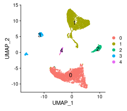
# If you haven't installed UMAP, you can do so via reticulate::py_install(packages =
# 'umap-learn')
tissu1 <- RunUMAP(tissu1, dims = 1:10)
# note that you can set `label = TRUE` or use the LabelClusters function to help label
# individual clusters
DimPlot(tissu1, reduction = "umap",label = T,label.size = 5)
#也可以tsne的方式展示细胞分区,但是umap给出的空间分布信息是有意义的,所以更倾向与使用umap
#tissu1 <- RunTSNE(tissu1, dims = 1:10)
#DimPlot(tissu1, reduction = "tsne",label = T,label.size = 5)
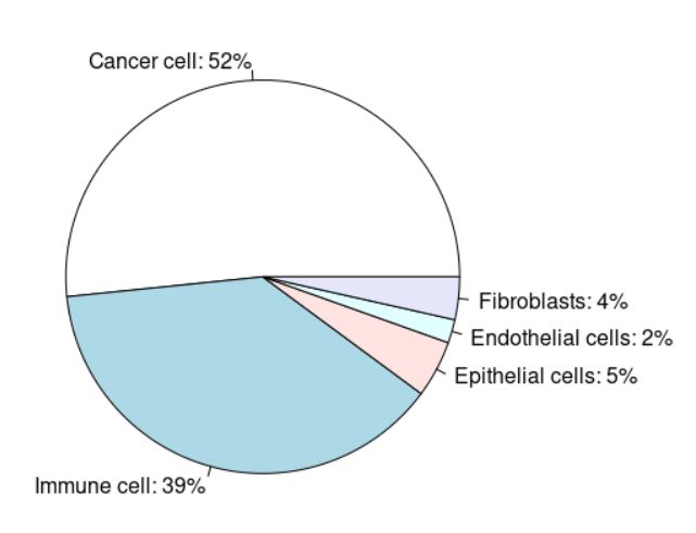
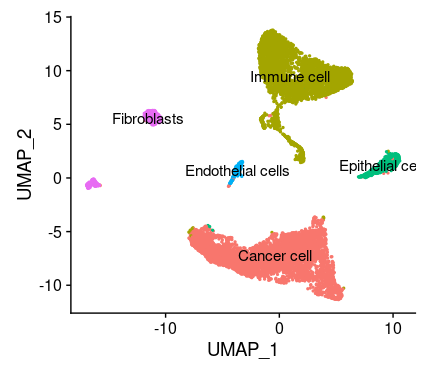
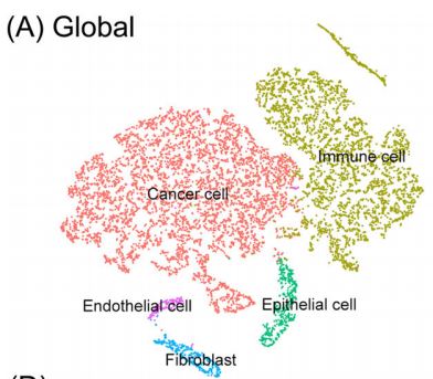
聚类结果,一共5个群

Step 7、差异表达

1
2
3
4
5
6
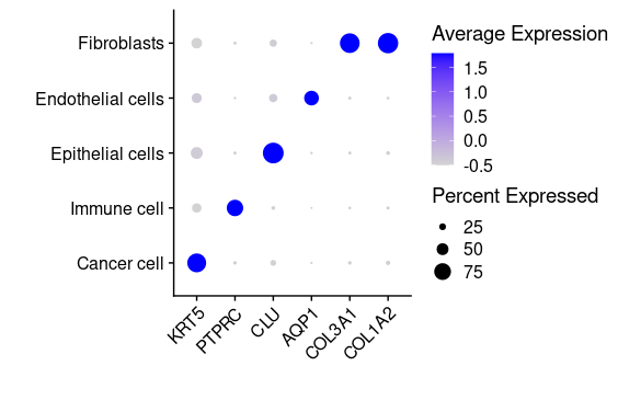
## =============== 差异表达及细胞类型鉴定
# find markers for every cluster compared to all remaining cells, report only the positive ones
tissu1.markers <- FindAllMarkers(tissu1, only.pos = TRUE, min.pct = 0.25, logfc.threshold = 0.25)
write.csv(tissu1.markers,file = "tissu1.markers.csv")
#展示每一个cluster中top2显著的marker
tissu1.markers %>% group_by(cluster) %>% top_n(n = 2, wt = avg_log2FC)

可视化特异性marker基因

1、 首先看一下文章中给出的marker基因

1
markergene<-c("KRT5","PTPRC","CLU","AQP1","COL3A1","COL1A2")

2、 根据上表将marker基因映射到亚群上,以此确定不同亚群的具体细胞类型

1
2
3
#umap可视化
#根据文章supplementary table 1中提供的亚群的marker gene信息,在此绘制表达图谱
FeaturePlot(tissu1, features = c("KRT5", "PTPRC", "CLU", "AQP1", "COL3A1", "COL1A2"))
1
2
3
4
5
6
7
#小提琴图可视化
library(ggplot2)
plot_list<-list()
for (i in 1:5) {
p=VlnPlot(tissu1,features = markergene[i])+NoLegend()
print(p)
}
1
2
3
#dotplot图可视化
DotPlot(tissu1, features = markergene)+RotatedAxis()+
scale_x_discrete("")+scale_y_discrete("")
1
2
3
4
5
6
7
8
9
10
11
12
13
14
15
16
17
#细胞亚群占比统计
cluster<-c("Cancer cell","Immune cell","Epithelial cells","Endothelial cells","Fibroblasts")

subset_cell<-c()
for (i in 1:5) {
subset_cell=c(subset_cell,dim(tissu1[,Idents(tissu1)%in%c(cluster[i])])[2])
}

subset_account<-c()
total_cells<-dim(tissu1)[2]
for (i in 1:5) {
subset_account=c(subset_account,subset_cell[i]/total_cells)
}

subset_account<-subset_account*100
per.cell <- paste(cluster,": ",ceiling(subset_account),"%",sep = "")
pie(subset_account,labels=per.cell)

文章中的各亚群占比

我们的计算结果如下,结果显示我们的计算结果和原文结果类似

Step 8、细胞亚群命名

1
2
3
4
5
6
7
8
9
10
## =============== 细胞类型鉴定
new.cluster.ids <- c("Cancer cell", #"KRT5"
"Immune cell", #"PTPRC"
"Epithelial cells", #"CLU"
"Endothelial cells", #"AQP1"
"Fibroblasts") #"COL3A1", "COL1A2"

names(new.cluster.ids) <- c(0,1,2,5,4)
tissu1 <- RenameIdents(tissu1, new.cluster.ids)
DimPlot(tissu1, reduction = "umap", label = TRUE, pt.size = 0.5) + NoLegend()

我们的聚类结果

原文的聚类结果

Step 9、细胞亚群提取及再分群

1
2
3
4
5
6
7
8
9
10
11
12
13
14
15
16
17
18
19
20
21
22
## =============== 
#肿瘤细胞的提取,下面两种方式都可以实现特定亚群的提取
Cancer_cell<-tissu1[,tissu1@meta.data$seurat_clusters%in%c(0)]
#Cancer_cell<-tissu1[,Idents(tissu1)%in%c("Cancer cell")]

#标准化之前
Cancer_cell <- NormalizeData(Cancer_cell, normalization.method = "LogNormalize", scale.factor = 10000)
Cancer_cell <- FindVariableFeatures(Cancer_cell, selection.method = 'vst', nfeatures = 2000)
# Identify the 10 most highly variable genes
top10 <- head(VariableFeatures(Cancer_cell), 10)
top10

Cancer_cell <- ScaleData(Cancer_cell, vars.to.regress = "percent.mt")
Cancer_cell <- RunPCA(Cancer_cell, features = VariableFeatures(object = Cancer_cell))
DimHeatmap(Cancer_cell, dims = 1:20, cells = 500, balanced = TRUE)
Cancer_cell <- FindNeighbors(Cancer_cell, dims = 1:10)
Cancer_cell <- FindClusters(Cancer_cell, resolution = 0.3)
Cancer_cell <- RunUMAP(Cancer_cell, dims = 1:10)
DimPlot(Cancer_cell, reduction = 'umap',label = T)

#cluster Keratinocyte Cancer
FeaturePlot(Cancer_cell, features = c("SPRR3","SPRR1A","NCCRP1","TMPRSS11E","APOBEC3A"))

绞尽脑汁,一顿操作,最后还是没有办法很好的复现原文的数据,但是其中一个亚群有较好的聚类出来。

总结

1、单细胞数据复现可以提升自己对此类数据的理解和掌握。
2、不同人处理单细胞数据时设置的参数会有所不同,作者并没有在文章中给出太多相关信息,导致最终的结果有所不同。
3、单细胞亚群个数的确定以及类群注释需要非常强的生物学背景。
4、 要学的东西太多了,一点点的来,不求快,但求稳,加油💪

Author

Yuqi Gong

Posted on

2021-05-13

Updated on

2022-11-26

Licensed under